Project Description
This project focuses on developing a Japanese‑themed boutique hotel concept and crafting a refined visual identity to support it. The hotel blends traditional Japanese aesthetics with modern luxury, creating a space that feels both timeless and contemporary. The branding is designed to evoke tranquility, simplicity, and relaxation, reflecting the calm, immersive atmosphere guests experience throughout the hotel.
Planning
The first step in creating this hotel was researching Japan itself, as I wanted our logo to feel truly authentic. Ultimately, I drew inspiration from the iconic Japanese flag and the country’s beautiful mountains.
After exploring many potential names for the hotel, “Mori” became the final choice. The hotel is located in Twin Lakes, Colorado, surrounded by dense forests, so I wanted a name that reflected both the tranquility of the trees and the beauty of Japanese culture. “Mori,” which translates to “forest” in Japanese, perfectly captures that connection.

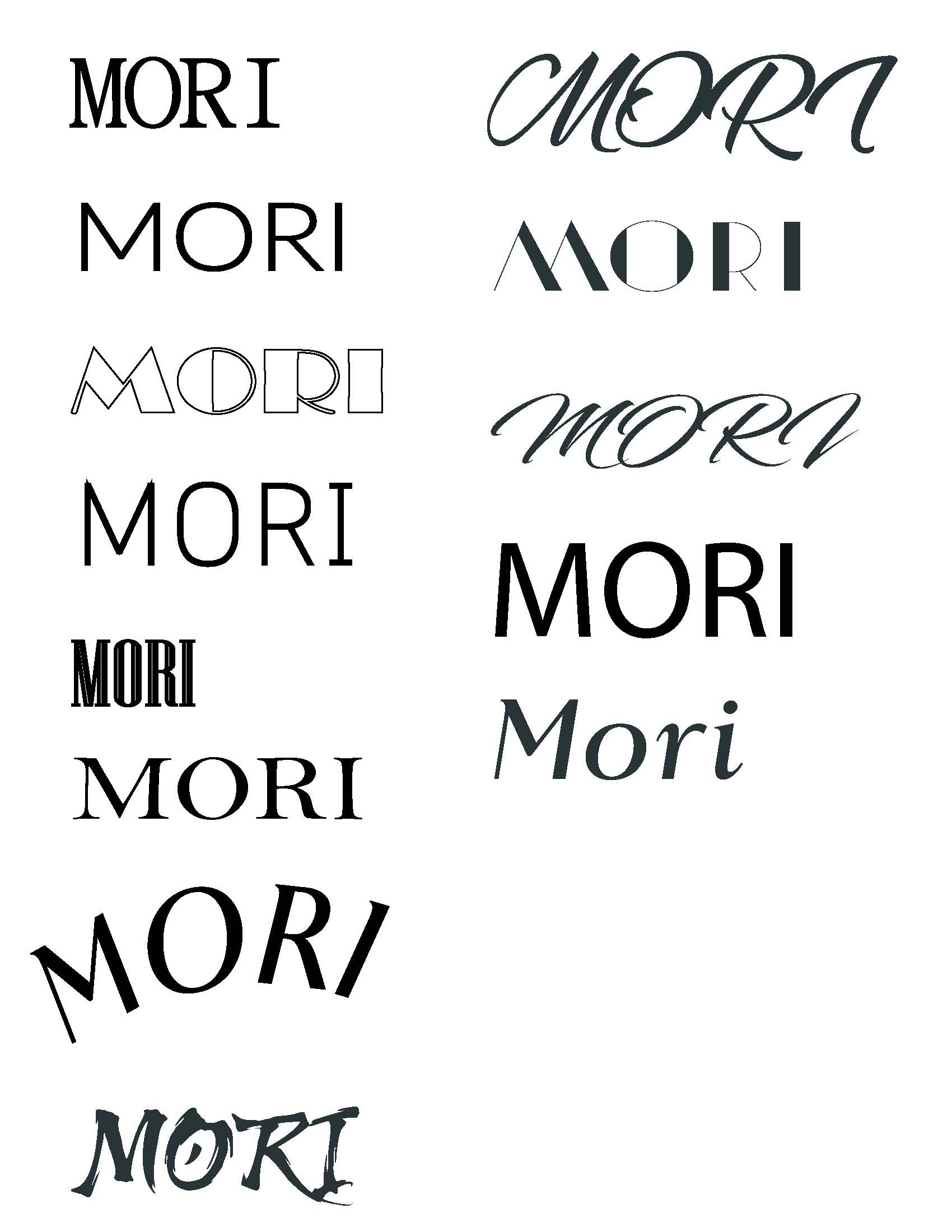
Typography Research
Typography plays an essential role in shaping the identity of Hotel Mori because the font I choose is going to communicate the brand’s story and identity.
Initially, choosing a font to represent the brand was a challenge because every typeface communicates something different about the identity of the hotel.
First Concept Logos
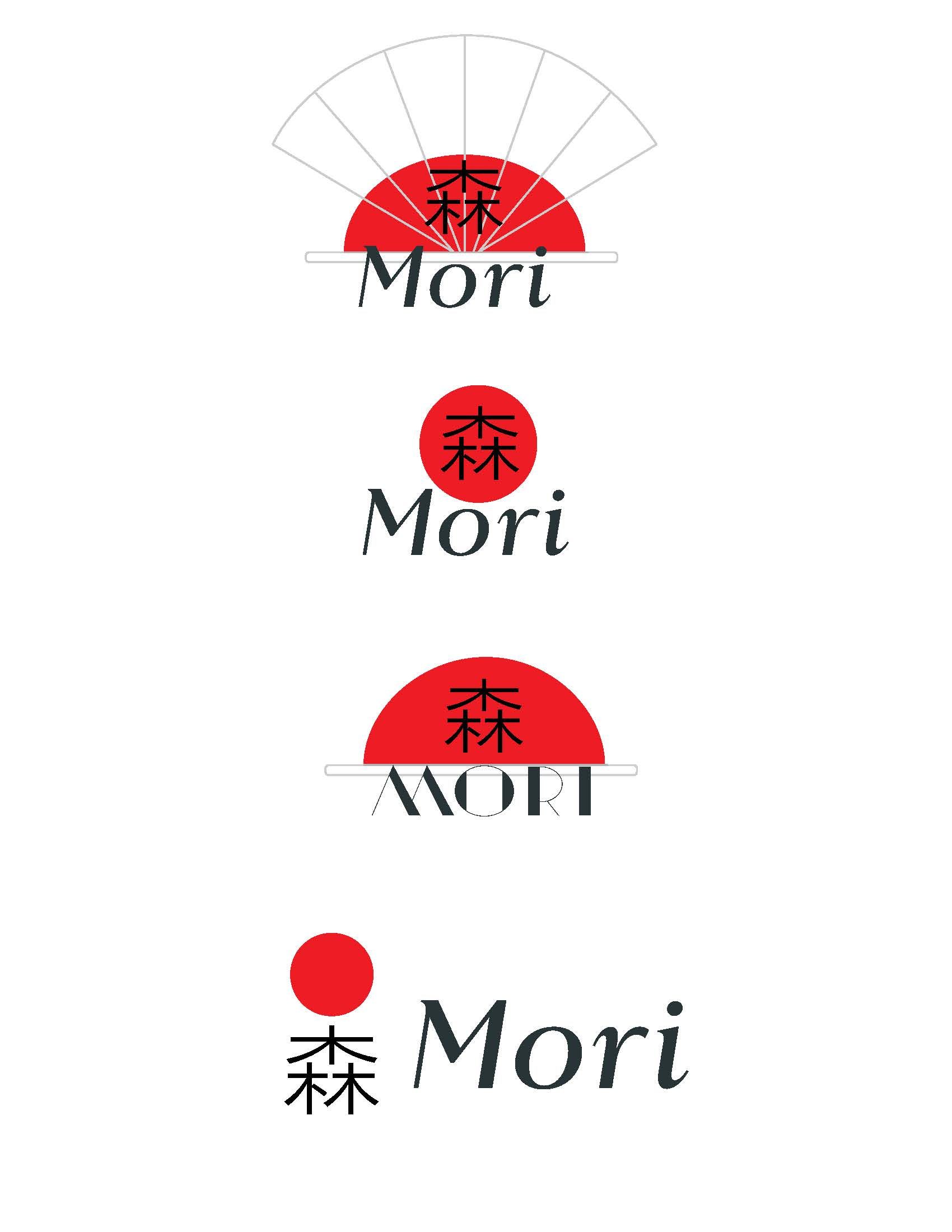
The first concept logos were inspired by the Japanese flag, and I initially wanted to incorporate the Japanese character for “Mori” into the design. However, after meeting with the graphic design professor, it became clear that the direction wasn’t fully supporting the brand. In the end, it was better to start over and develop a new concept that aligned more strongly with the hotel’s identity.
Second Concept Logos
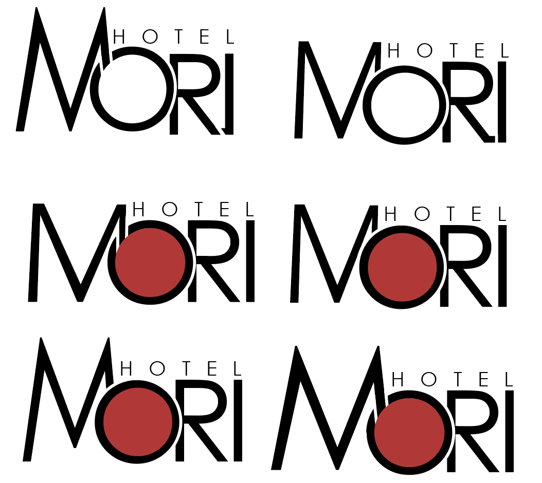
The second round of concept logos was a major step toward the brand identity I envisioned. Using Century Gothic as the base typeface, I focused on refining the “M,” drawing inspiration from the surrounding mountains. I experimented with multiple variations before deciding on a pointed “M” instead of the original flat form. I also wanted the “O” to become a defining element of the logo, since the mark needed to be flexible across applications such as menus, shirts, and hotel decals. Over time, the “O” evolved into the key feature of the identity, allowing it to adapt to different contexts—whether shown in color for the website and menus or in a simple black‑and‑white version for staff uniforms.
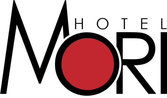
Final Logo Decision
After another meeting with the graphic design professor the final logo was desided